PRODUCT
UI DESIGN
DISCOVERY
USABILITY TESTING
How a UX-driven redesign made a product easier to sell.
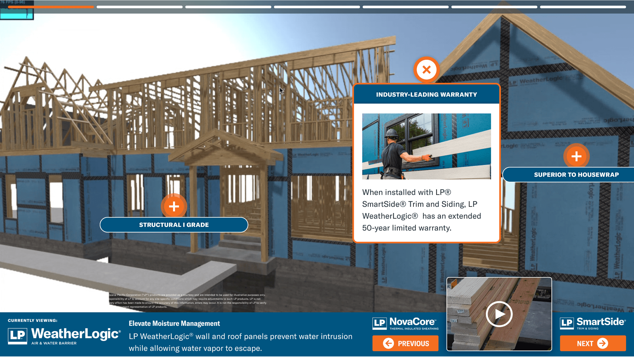
Odyssey Relocation's outdated client portal was making it harder than it should be for users to navigate their relocation journeys, and harder for the sales team to confidently showcase the product to potential clients. With an outdated interface, confusing navigation, and inconsistent user flows, the portal didn’t reflect the quality of service Odyssey provides. I partnered directly with leadership to redesign the experience from the ground up, modernizing the UI, improving usability, and creating a system they can proudly stand behind.
My Role:
Sole UX Designer Discovery Client Relations UI Design
My Contributions:
Discovery Sprint Defined Personas Mapped User Flows Improved Navigation Conducted Usability Testing

PRODUCT
UI DESIGN
DISCOVERY
USABILITY TESTING
How a UX-driven redesign made a product easier to sell.
Odyssey Relocation's outdated client portal was making it harder than it should be for users to navigate their relocation journeys, and harder for the sales team to confidently showcase the product to potential clients. With an outdated interface, confusing navigation, and inconsistent user flows, the portal didn’t reflect the quality of service Odyssey provides. I partnered directly with leadership to redesign the experience from the ground up, modernizing the UI, improving usability, and creating a system they can proudly stand behind.
My Role:
Sole UX Designer Discovery Client Relations UI Design
My Contributions:
Discovery Sprint Defined Personas Mapped User Flows Improved Navigation Conducted Usability Testing
1
Satisfied CEO
8
Major Screens Redesigned
100%
New Design System Established
1
Satisfied CEO
8
Major Screens Redesigned
100%
New Design System Established
1
Satisfied CEO
8
Major Screens Redesigned
100%
New Design System Established
Modernizing the portal’s design and user flows turned an outdated experience into a polished, intuitive tool that the sales team is proud to share.
Modernizing the portal’s design and user flows turned an outdated experience into a polished, intuitive tool that the sales team is proud to share.
Modernizing the portal’s design and user flows turned an outdated experience into a polished, intuitive tool that the sales team is proud to share.
Modernizing the portal’s design and user flows turned an outdated experience into a polished, intuitive tool that the sales team is proud to share.

BEFORE
Flex benefits buried in complex flows.
One of the challenges of refining the customer portal was exposing critical parts of the experience, like managing flex benefits.

AFTER
Simplifying the user flow by 3 clicks.
Creating a new "Manage My Move" item in the main nav brought the flex benefits action to the forefront of the experience.
BEFORE
Flex benefits buried in complex flows.
One of the challenges of refining the customer portal was exposing critical parts of the experience, like managing flex benefits.
AFTER
Simplifying the user flow by 3 clicks.
Creating a new "Manage My Move" item in the main nav brought the flex benefits action to the forefront of the experience.
NEW DASHBOARD SCREEN
Users need a homebase to get their bearings.
I designed a dashboard where users could get an overview of their relocation process, with helpful shortcuts to essential documents, expenses, and their task list.

NEW DASHBOARD SCREEN
Users need a homebase to get their bearings.
I designed a dashboard where users could get an overview of their relocation process, with helpful shortcuts to essential documents, expenses, and their task list.
NEW DASHBOARD SCREEN
Users need a homebase to get their bearings.
I designed a dashboard where users could get an overview of their relocation process, with helpful shortcuts to essential documents, expenses, and their task list.
NEW DASHBOARD SCREEN
Users need a homebase to get their bearings.
I designed a dashboard where users could get an overview of their relocation process, with helpful shortcuts to essential documents, expenses, and their task list.
MOBILE DESIGNS
Users need a mobile experience to plan their move on the go.
As part of phase 2 of the project, I'm designing a mobile experience of the transferee portal. This will allow our users more flexibility as they move through the relo process.

MOBILE DESIGNS
Users need a mobile experience to plan their move on the go.
As part of phase 2 of the project, I'm designing a mobile experience of the transferee portal. This will allow our users more flexibility as they move through the relo process.
MOBILE DESIGNS
Users need a mobile experience to plan their move on the go.
As part of phase 2 of the project, I'm designing a mobile experience of the transferee portal. This will allow our users more flexibility as they move through the relo process.
MOBILE DESIGNS
Users need a mobile experience to plan their move on the go.
As part of phase 2 of the project, I'm designing a mobile experience of the transferee portal. This will allow our users more flexibility as they move through the relo process.
ANNOTATIONS
A detailed handoff was necessary.
I would not have access to the engineering team, so I left detailed annotations for each screen. This was a quick turnaround, so sometimes annotations had to replace designs of various states or flows.

ANNOTATIONS
A detailed handoff was necessary.
I would not have access to the engineering team, so I left detailed annotations for each screen. This was a quick turnaround, so sometimes annotations had to replace designs of various states or flows.
ANNOTATIONS
A detailed handoff was necessary.
I would not have access to the engineering team, so I left detailed annotations for each screen. This was a quick turnaround, so sometimes annotations had to replace designs of various states or flows.
ANNOTATIONS
A detailed handoff was necessary.
I would not have access to the engineering team, so I left detailed annotations for each screen. This was a quick turnaround, so sometimes annotations had to replace designs of various states or flows.
THE RESULTS
Designing a portal that reflects Odyssey’s people-first mission.
I led the redesign of the Odyssey portal to align its digital experience with the organization’s mission, replacing a legacy interface with an intuitive, people-centered UI. By streamlining complex flows and clarifying navigation, I empowered users with greater transparency and control. This initial release doesn't just look better, it establishes a scalable architectural foundation.
CHALLENGES & COMPROMISES
Finding the balance between user & business needs.
With limited time and minimal data, I leaned on intuition to guide the process, later validating decisions with the team’s deep understanding of user and sales pain points.
Racing the Clock
I prioritized high-impact changes and quick wins, ensuring we made meaningful improvements without sacrificing quality.
Designing Without Direct User Access
I leaned on guerilla testing with stand-ins, combined with intuition and design best practices, to guide user-centric decisions.
Balancing Business and User Needs
Through strategic design choices, I found compromises that made the portal visually impressive and more intuitive for real users.
MY KEY CONTRIBUTIONS
A successful partnership between me and the client.
I owned the end-to-end design lifecycle, beginning with a strategic audit of existing user flows to eliminate friction and secure immediate usability wins. To ensure the product could scale without losing its polish, I architected a custom design system and maintained a tight feedback loop with leadership and users, guaranteeing every UI refinement was both validated and aligned with long-term business goals.
IN CONCLUSION
Their technology is becoming a key selling point for the business.
This project demonstrated how strategic design, even on a tight timeline, can make a legacy product feel modern. As we continue into Phase 2, I'm excited to see where we take the rest of the product suite.
IN CONCLUSION
Their technology is becoming a key selling point for the business.
This project demonstrated how strategic design, even on a tight timeline, can make a legacy product feel modern. As we continue into Phase 2, I'm excited to see where we take the rest of the product suite.
IN CONCLUSION
Their technology is becoming a key selling point for the business.
This project demonstrated how strategic design, even on a tight timeline, can make a legacy product feel modern. As we continue into Phase 2, I'm excited to see where we take the rest of the product suite.
IN CONCLUSION
Their technology is becoming a key selling point for the business.
This project demonstrated how strategic design, even on a tight timeline, can make a legacy product feel modern. As we continue into Phase 2, I'm excited to see where we take the rest of the product suite.